Living Colorful Quiet Luxury: A Practical Guide to Refined Color in Modern Interiors
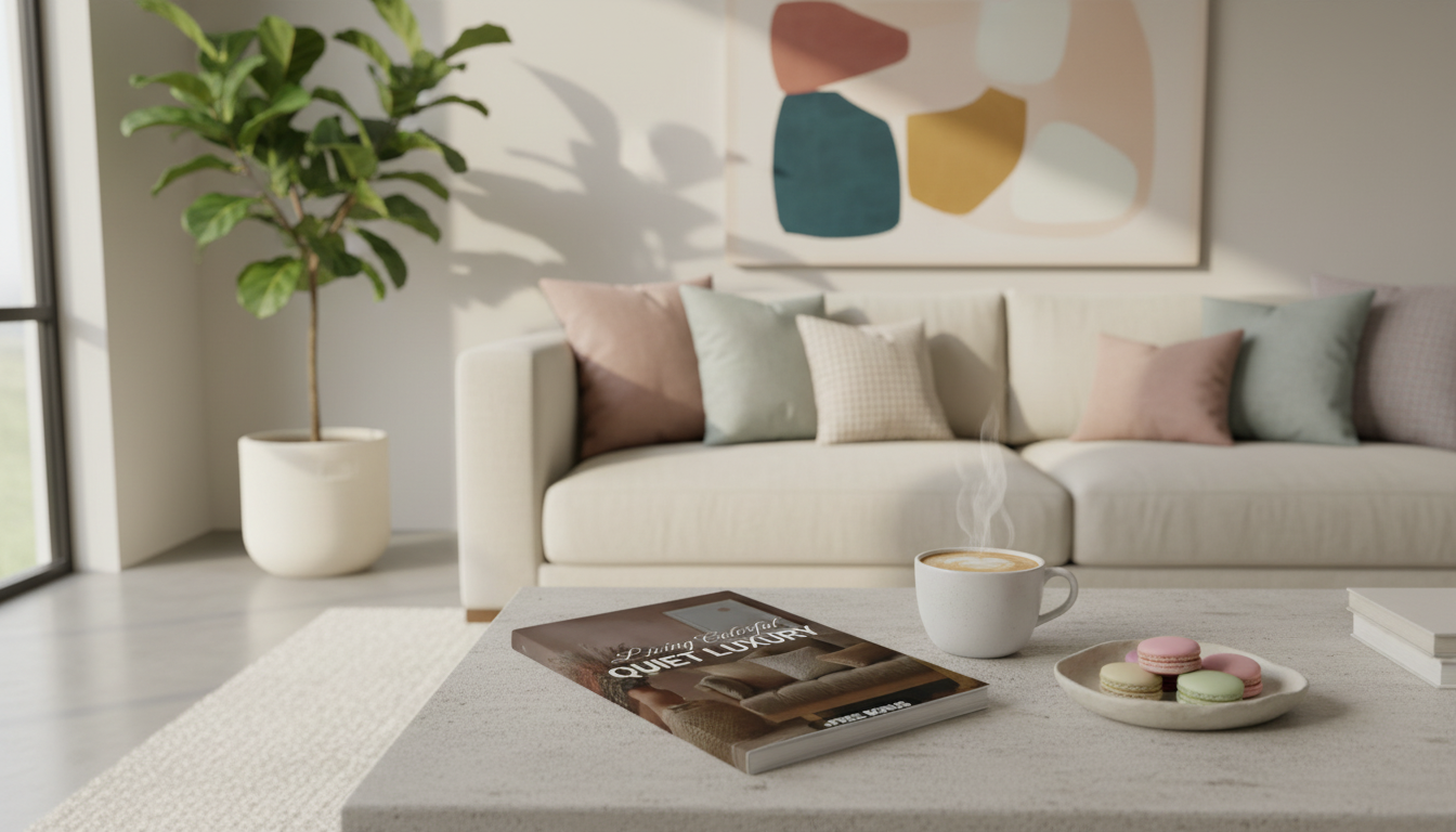
Color and quiet luxury can live in the same room—the difference is how you use it. Instead of spreading bright tones everywhere, colorful quiet luxury relies on restraint, premium materials, and a palette that feels intentional in every corner. The result is modern, calm, and elevated: richer hues that read as refined rather than restless. For more guidance, see [PDF] Interior Design Guidelines | UC Davis Health.
What “Colorful Quiet Luxury” Looks Like in Practice
Think of colorful quiet luxury as a composed backdrop with a few confident, high-quality color moments. It typically includes: For further reading, see [PDF] Interior Design Magazine – extnag.tacc.utexas.edu.
- A calm base of warm whites, stone, greige, soft taupe, or gentle charcoal—paired with one or two saturated accents.
- Color appearing in controlled zones (a statement wall, a rug field, a sofa, or a tight accessories vignette) rather than across every surface.
- Low-contrast transitions within the same color family (clay → terracotta → oxblood) to add depth without visual noise.
- A luxe feel driven by materials and finishes—wool, linen, mohair, natural wood, stone, and metal—just as much as by the hue itself.
- Modern silhouettes that keep bold color crisp: clean-lined furniture, simple window treatments, and minimal patterns.
Start With a Base Palette That Carries the Room
When the foundation is cohesive, you can afford to go deeper with color—without losing the “quiet.” Start here:
- Choose 2–3 base neutrals and repeat them across walls, large upholstery, and casegoods. Repetition is what makes the room feel settled.
- Match undertones to avoid subtle clashes. Warm neutrals tend to pair best with earthy reds and greens; cool neutrals typically play better with blue-based hues. For terminology help, see Sherwin-Williams’ Color Glossary.
- Treat black as a spice: a little in frames, lighting, or hardware adds definition without hardening the space.
- Lean matte or eggshell on walls for softness; use gloss selectively (trim, lacquer, a single accent piece) for a deliberate contrast.
- Anchor the palette with a real “material note”—natural wood, stone, or metal—so richer colors don’t feel synthetic or overly trend-led.
Color Ratios That Stay Calm (Even When the Hue Is Bold)
A simple ratio prevents overbuying, overmixing, and “why does this feel busy?” regret. A modern quiet-luxury rule of thumb is: dominant base + supportive secondary + a clear accent.
- Limit accents to one hero hue plus one minor supporting shade; too many accents read scattered.
- Increase intensity through depth, not quantity. One deep emerald velvet chair can feel quieter than ten bright accessories.
- Repeat the accent at least three times (pillow, art, ceramic) so it feels intentional rather than random.
- Use pattern sparingly; if you add pattern, keep either the scale large and simple or the color contrast low.
Modern Quiet-Luxury Palette Recipes (with easy ratios)
| Palette |
Base (70%) |
Secondary (20%) |
Accent (10%) |
Best materials to pair |
| Stone + Ink |
Warm white / limestone |
Soft charcoal |
Inky navy |
Oak, brushed nickel, wool bouclé |
| Sand + Olive |
Creamy beige |
Light greige |
Muted olive |
Linen, travertine, aged brass |
| Clay + Merlot |
Soft taupe |
Warm putty |
Merlot / oxblood |
Walnut, mohair, ceramic glazes |
| Pearl + Emerald |
Pearl white |
Mist gray |
Deep emerald |
Velvet, marble, blackened steel |
| Oat + Saffron |
Oatmeal |
Mushroom |
Saffron |
Jute, natural woods, woven textures |
Room-by-Room Moves That Add Color Without Clutter
Texture, Finish, and Lighting: The Quiet-Luxury Multipliers
- Layer textures within the same color family (bouclé + linen + wool + leather) so even simple palettes feel expensive.
- Choose fewer, better objects; negative space is part of the luxury signal.
- Mix finishes for depth: matte walls, satin textiles, a subtle metallic, plus one reflective element (mirror or glazed ceramic).
- Use warm, consistent lighting (often 2700K–3000K) so rich colors don’t turn harsh at night; for lighting accuracy, see CRI basics from the U.S. Department of Energy.
- Add dimmers where possible—quiet luxury is as much atmosphere as it is objects.
Common Mistakes That Make Color Feel Loud (and Simple Fixes)
A Simple 30-Minute Palette Plan Before Buying Anything
- Pick one inspiration image that feels calm and modern; identify its base neutral and its accent.
- Choose one “material anchor” (wood tone, stone, or metal finish) that will appear in at least three places.
- Decide exactly where the accent color will live (one large item + two small repeats) and where it will not.
- Collect 5–7 swatches: two neutrals, one secondary, one accent, plus 1–2 textures (fabric or rug).
- Do a quick lighting check: view swatches in daytime and evening light before committing. If you want a deeper framework, the Munsell Color System overview is a useful way to understand hue, value, and chroma.
Curated Picks to Support a Calm, Color-Forward Look
FAQ
Can quiet luxury include bright colors?
Yes—start with a calm neutral foundation, use one hero hue in controlled zones, and repeat it intentionally. Premium textures and clean, modern lines help bright color read refined instead of busy.
What is the easiest way to choose a color palette for a modern home?
Begin with 2–3 cohesive neutrals, then add one accent color at a controlled ratio such as 70/20/10. Confirm undertones and test swatches in both daytime and evening lighting.
How many accent colors work best for a calm, elevated look?
One primary accent plus one minor supporting shade is usually ideal. More can work only when contrast is low and the palette is repeated in a very consistent way.
Recommended for you







Leave a comment