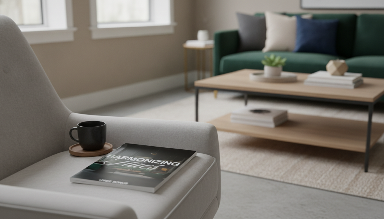
Neutral palettes bring calm structure to a space—clean, flexible, and easy to live with. Jewel tones add the “why does this room look so good?” factor: depth, contrast, and personality that feels intentional rather than loud. Below is a practical way to combine the two, from undertones and ratios to room-by-room pairings, texture tricks, and simple visualization steps that prevent costly mismatches. For more guidance, see Jewel Tone Colors: A Guide to Using Rich Hues – Havenly.
Neutrals function as a visual resting place. When walls, large rugs, or primary upholstery stay quiet, saturated colors read refined—more “tailored” than “shouting.” Jewel tones like emerald, sapphire, amethyst, and ruby also have a timeless, almost heritage quality that fits modern, transitional, and traditional spaces. For further reading, see Jewel Tone Colors: A Guide to Vibrant Interior Design.
This approach stays flexible over time: swap pillows, curtains, art, or a throw for a new season without repainting the entire home. It also scales easily. You can go high-contrast (crisp white with cobalt) or low-contrast (taupe with burgundy), which helps both compact rooms and open layouts feel balanced.
Before falling for a jewel-tone accent, check the undertone of your neutral base. In most homes, the “neutral” isn’t truly neutral—it leans warm, cool, or balanced.
Next, match that undertone to fixed elements you’re not changing soon: flooring, countertops, tile, cabinetry, or a large sofa. A reliable rule is the “largest surface rule”: if you want jewel tones to look effortless, keep the biggest surfaces neutral and let the saturated color show up in controlled moments.
Finally, keep metal finishes aligned with undertones. Warm neutrals look especially natural with brass or bronze; cool neutrals feel crisp with chrome or nickel. If you want more detail on how light affects color perception, the International Commission on Illumination (CIE) is a strong reference point for lighting fundamentals.
| Neutral base | Best jewel tones | Best supporting accents | Avoid if the room is already… |
|---|---|---|---|
| Warm white / cream | Emerald, ruby, topaz | Brass, walnut, terracotta, ivory textiles | Heavy on orange-brown woods and warm lighting |
| Cool white / soft gray | Sapphire, amethyst, deep teal | Chrome, black accents, ash wood, crisp white trim | Dominated by cool blue light and lots of gray stone |
| Greige / taupe | Emerald, sapphire, burgundy | Brass or black hardware, natural linen, oak | Very dark floors plus low natural light |
| Charcoal / deep neutral | Ruby, cobalt, emerald (as highlights) | Matte black, smoked glass, warm wood to balance | Small rooms without layered lighting |
A clear ratio stops jewel tones from drifting into “random pops of color.” For most rooms, aim for 60% neutral (walls/large rug/sofa), 30% secondary neutral or texture (linen drapery, wood tones, woven pieces), and 10% jewel-tone accent (pillows, art, a chair, a statement vase).
If you want a bolder look, shift to 50/30/20—but keep the jewel tone concentrated into one main feature (one wall, one sofa, or one large rug) rather than sprinkled everywhere. Then repeat the jewel tone at least two more times in small details to make the room feel cohesive.
Texture is your saturation “dimmer.” Velvet, bouclé, linen, and natural fibers soften intense hues, making jewel tones read rich instead of harsh.
Start with a neutral sofa and add jewel-tone velvet chairs or a single bold ottoman. Anchor everything with a rug that includes both the neutral base and a hint of your jewel tone to connect the palette.
Warm neutral walls pair beautifully with sapphire bedding for a calm-but-luxurious contrast. Add structure with black picture frames or dark wood nightstands. If storage furniture is part of the plan, a warm wood piece can act as a natural bridge between soft walls and saturated textiles.
Digital visualization can help confirm undertones before you commit—especially for curtains, rugs, or large accent furniture. If you want a ready-to-use framework (plus a checklist you can reuse every time you refresh a room), the Harmonizing Hues digital guide walks through the pairing steps and includes practical AI design tips.
Look for warm whites/creams, greige, taupe, or soft gray, then match the undertone to your fixed finishes (floors, counters, cabinetry) and your lighting. When undertones align, jewel tones look richer and more intentional.
One dominant jewel tone is usually enough, with zero or one supporting jewel tone at most. Keep large surfaces neutral, repeat the main jewel tone 2–3 times in smaller accents, and follow a clear ratio like 60/30/10.
They can make a room feel cozier, but not necessarily smaller if you control contrast and lighting. Keep ceilings and trim lighter, use mirrors or reflective finishes, add layered lighting, and concentrate jewel color in textiles or one focal surface.











Leave a comment